Presenting system alerts in SwiftUI is super easy. Just call the instance of Alert class and pass the respecting parameters, but system alerts are very basic and non-customizable default design. So it’s better to design and present your own custom alert as easily as we are presenting system alerts.
If you want to read an article about presenting system alerts you can check it here.
In this article, I will explain the complete procedure in detail with design the alert to presenting the custom alert in SwiftUI.
Here’s is the video if you prefer video over text:
Final Output.
1. Create a New Swift Project
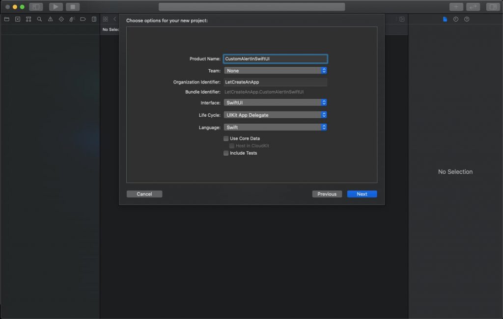
Open Xcode, Select App and click on next and give a proper name to the project and make sure to select the user interface should be SwiftUI, and create the project.
2. Create Basic UI
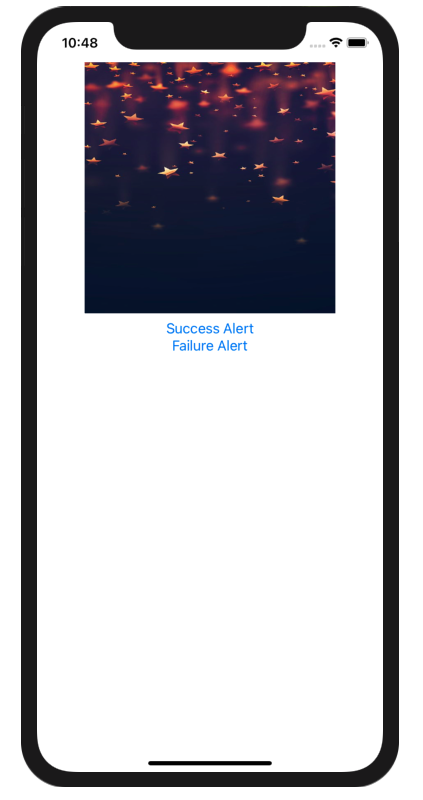
First, we are going to create the basic UI in which we will add 1 Image and 2 Buttons for Success and Failure alert.
We are using ZStack as parent stack for all the other stack, ZStack allow us to put the other layers on the top of each other.
The custom alert will add another view on the parent view, that’s why we are using ZStack on the ContentView.Swift file
ZStack {
    VStack {
           Image("demo")
           .resizable().frame(width: 300, height: 300)
            VStack {
            Button("Success Alert") { // Button title
            // Button action
             }

              Button("Failure Alert") { // Button title
            // Button action
             }
     }
}
Preview the above code it will look something like this.
2. Create Custom Alert Design
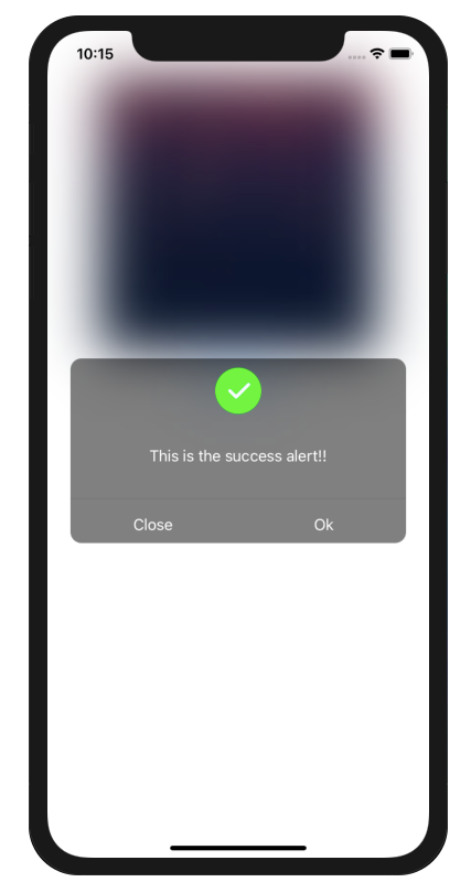
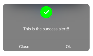
Create a new class AlertView.Swift, In this class we need to create a custom alert design, with messages and multiple buttons. We are arranging all the view vertical order, so we need to use VStack as a parent stack in this design. You can change the design as per your need.
VStack {

   Image("check").resizable().frame(width: 50, height: 50).padding(.top, 10)
    Spacer()
     Text("This is the    successalert!!").foregroundColor(Color.white)
    Spacer()
    Divider()
    HStack {
        Button("Close") { // Button title
            // Button action
        }.foregroundColor(.white) // Change the title of button
         .frame(width: UIScreen.main.bounds.width/2-30, height: 40) // Change the frames of button

        Button("Ok") { // Button title
            // Button action
        }.foregroundColor(.white) // Change the title of button
        .frame(width: UIScreen.main.bounds.width/2-30, height: 40) // Change the frames of button

          }
            }.frame(width: UIScreen.main.bounds.width-50, height: 200)

         .background(Color.black.opacity(0.5))
         .cornerRadius(12)
         .clipped()
Preview the above code it will look something like this.
3. Presenting Custom Alert
Now we need to present the Custom alert on the top of the ContentView. So we need to create one @State property in ContentView.Swift which will update the View when that property change.
@State var shown = false This property gets toggle when the user clicks on any of the buttons on the ContentView.Swift file.
Button("Success Alert") {
     shown.toggle()
}
Now on the basis of shown property, we need to blur the ContentView for that add the blur property at the end of VStack.
.blur(radius: shown ? 30 : 0) Now add the AlertView.Swift at the end of VStack when the shown property is true on the ContentView.Swift
if shown {
     AlertView(shown: $shown) // AlertView intialize with shown property
   }
We also need to create one @Binding property in AlertView.View file. This property gets an update when the user clicks on the CLOSE or OK button on the AlertView.swift file.
@Binding var shown: Bool Update this shown property when user click on OK or CANCEL button.
Button("OK") {
     shown.toggle()
}
This will update the shown property of ContentView.swift file and render the view again. So this property hold false, it will hide the AlertView from the screen.
This is the simplest way we can show the AlertView on ContentView.
In a similar way, we can define multiple configurable properties like the message, button actions, alert image, in AlertView and update them on ContentView to see the desired results.
Complete Code:
ContentView.Swift
struct ContentView: View {

@State var shown = false
@State var message = ""
@State var c: AlertAction?
@State var isSuccess = false

var body: some View {

    ZStack {
            VStack {
                Image("demo")
                    .resizable().frame(width: 300, height: 300)
                VStack {
                    Button("Success Alert") {
                        isSuccess = true
                        message = "This is the success alert!!"
                        shown.toggle()
                    }

                    Button("Failure Alert") {
                        isSuccess = false
                        message = "This is the failure alert!!"
                        shown.toggle()

                    }
                    Text(c == .ok ? "ok Clikced" : c == .cancel ? "Cancel Clicked" : "")

                }
                Spacer()
            }.blur(radius: shown ? 30 : 0)

        if shown {
            AlertView(shown: $shown, closureA: $c, isSuccess: isSuccess, message: message)
        }

    }
}

}
AlertView.Swift
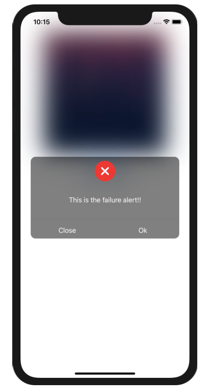
struct AlertView: View {

     @Binding var shown: Bool
     @Binding var closureA: AlertAction?
     var isSuccess: Bool
     var message: String

     var body: some View {
         VStack {

             Image(isSuccess ? "check":"remove").resizable().frame(width: 50, height: 50).padding(.top, /*@START_MENU_TOKEN@*/10/*@END_MENU_TOKEN@*/)
             Spacer()
             Text(message).foregroundColor(Color.white)
             Spacer()
             Divider()
             HStack {
                 Button("Close") {
                     closureA = .cancel
                     shown.toggle()
                 }.frame(width: UIScreen.main.bounds.width/2-30, height: 40)
                 .foregroundColor(.white)

                 Button("Ok") {
                     closureA = .ok
                     shown.toggle()
                 }.frame(width: UIScreen.main.bounds.width/2-30, height: 40)
                 .foregroundColor(.white)

             }

         }.frame(width: UIScreen.main.bounds.width-50, height: 200)

         .background(Color.black.opacity(0.5))
         .cornerRadius(12)
         .clipped()

     }
 }
Now you can build the application and see the custom alert working.
You can download the source code of this project from this this Link.
I hope you like this tutorial and if you want any help let me know in the comment section.
Stay tuned, there is way more to come! follow me on Youtube, Instagram, Twitter. So you don’t miss out on all future Articles and Video tutorials.
. . .
I am delighted that you read my article! If you have any suggestions do let me know! I’d love to hear from you. ????


how to show animation/transition when the alert appear?