In this iOS tutorial, we will talk about how we can implement
Tabbed View or Tab View in SwiftUI. Tab View use to display a view when tab items are selected. Each tab item can contain Image and Text. Creating Tab View in SwiftUI is very easy as compared to the swift. In this tutorial, we will create 4 tabs with there respective screens. so let’s start the article without wasting any time.
If you want to watch the video tutorial of this article instead, here you go:
Requirments:
You need macOS Catalina and Xcode 11 or above in order to have SwiftUI work in the simulator.
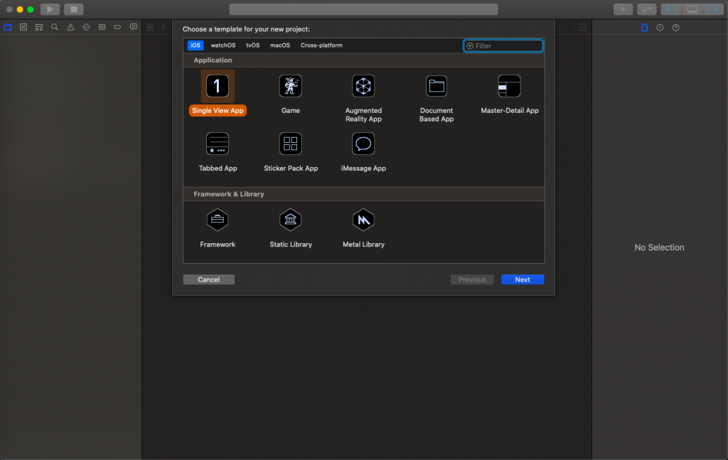
1. Create a New SwiftUI Project
Open Xcode 11 and select a Single View Application and click on Next.
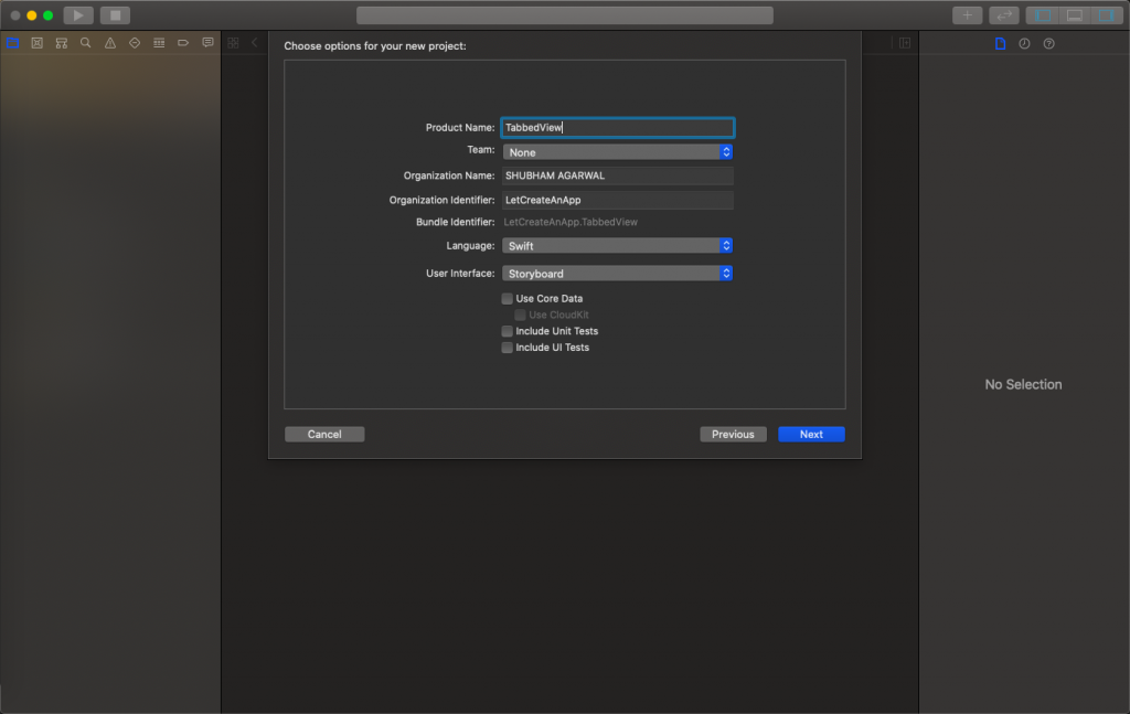
Next, give a proper name to the project and make sure to select the user interface should be SwiftUI, and create the project.
2. Add Tab View in Content View.
First, we need to add the Tab View in the content view and we need to create 4 more child content views which will work as a Tab items in Tab View. I have created Account Tab, Gallary Tab, Notification Tab, and changed the Text values to respective class names. Now we need to add all the Views in content view as seen below.
import SwiftUI

struct ContentView: View {

    var body: some View {
        TabView {
            AccountTab()
                .tabItem {
                    Image("Account_Selected" )
                    Text(verbatim: "Account")
            }

            GallaryTab()
                .tabItem {
                    Image("Gallery_Selected")
                    Text(verbatim: "Gallary")
            }

            ProfileTab()
                .tabItem {
                    Image("Home_Selected")
                    Text(verbatim: "Profile")
            }

            Notification()
                .tabItem {
                    Image("Notification_Selected")
                    Text(verbatim: "Notification")
            }
        }
    }
}

struct ContentView_Previews: PreviewProvider {
    static var previews: some View {
        ContentView()
    }
}
Note: You need to add the images into the asset folder, you will get the assets in the project. Link of the project in the end.
3. Provide tags to Tab Items.
Tags are the index values of each tab. Tag values use to identify the selected tab and also use to change the selected and unselected images for each tab. We also need to create and assign one @State binding property to get the selected tab.
For changing the title color we need to use accent color property at tab view.
import SwiftUI

struct ContentView: View {

   @State var selectedTab = 0

    var body: some View {
        TabView(selection: $selectedTab) {
            AccountTab()
                .tabItem {
                    Image( selectedTab == 0 ? "Account_Selected" : "Account_Unselected" )
                    Text(verbatim: "Account")
            }.tag(0)

            GallaryTab()
                .tabItem {
                    Image( selectedTab == 1 ? "Gallery_Selected" : "Gallery_Unselected" )
                    Text(verbatim: "Gallary")
            }.tag(1)

            ProfileTab()
                .tabItem {
                    Image( selectedTab == 2 ? "Home_Selected" : "Home_Unselected" )
                    Text(verbatim: "Profile")
            }.tag(2)

            Notification()
                .tabItem {
                    Image( selectedTab == 3 ? "Notification_Selected" : "Notification_Unselected" )
                    Text(verbatim: "Notification")
            }.tag(3)
        }.accentColor(.black)
    }
}

struct ContentView_Previews: PreviewProvider {
    static var previews: some View {
        ContentView()
    }
}
In the above code, we have set the tags for every tab item and by using the tag value we changing the tab image. Whenever user click any of the tabs them that tab tag value assigns to selectedTab property and tab view update itself to show the correct image and color. We can also customize the tab view as per our requirement.
This is the final code and for download the project please click this link -> Link
I hope you like this tutorial and if you want any help let me know in the comment section.— there is way more to come! You can follow me on Youtube, Instagram, and Twitter to not miss out on all future Articles and Video tutorials.
. . .
I am really happy you read my article! If you have any suggestions or improvements of any kind let me know! I’d love to hear from you! ????